British Business Bank
Designing the path to financing for small businesses
Background
After years of organic growth, British Business Bank’s website had become cluttered, with a lot of content added without much thought to the overall flows. With an outdated CMS needing updating, the bank planned to to move to a new platform and bake additional separate domains of theirs into the new website in the process.
Our task
Consolidating websites where beneficial and creating a common structure and design for British Business Bank’s websites. While the design task was a “lift-and-shift” of the current content, we challenged ourselves to find small ways to improve the UX flows and making sure the site catered better to its different audiences.
The client
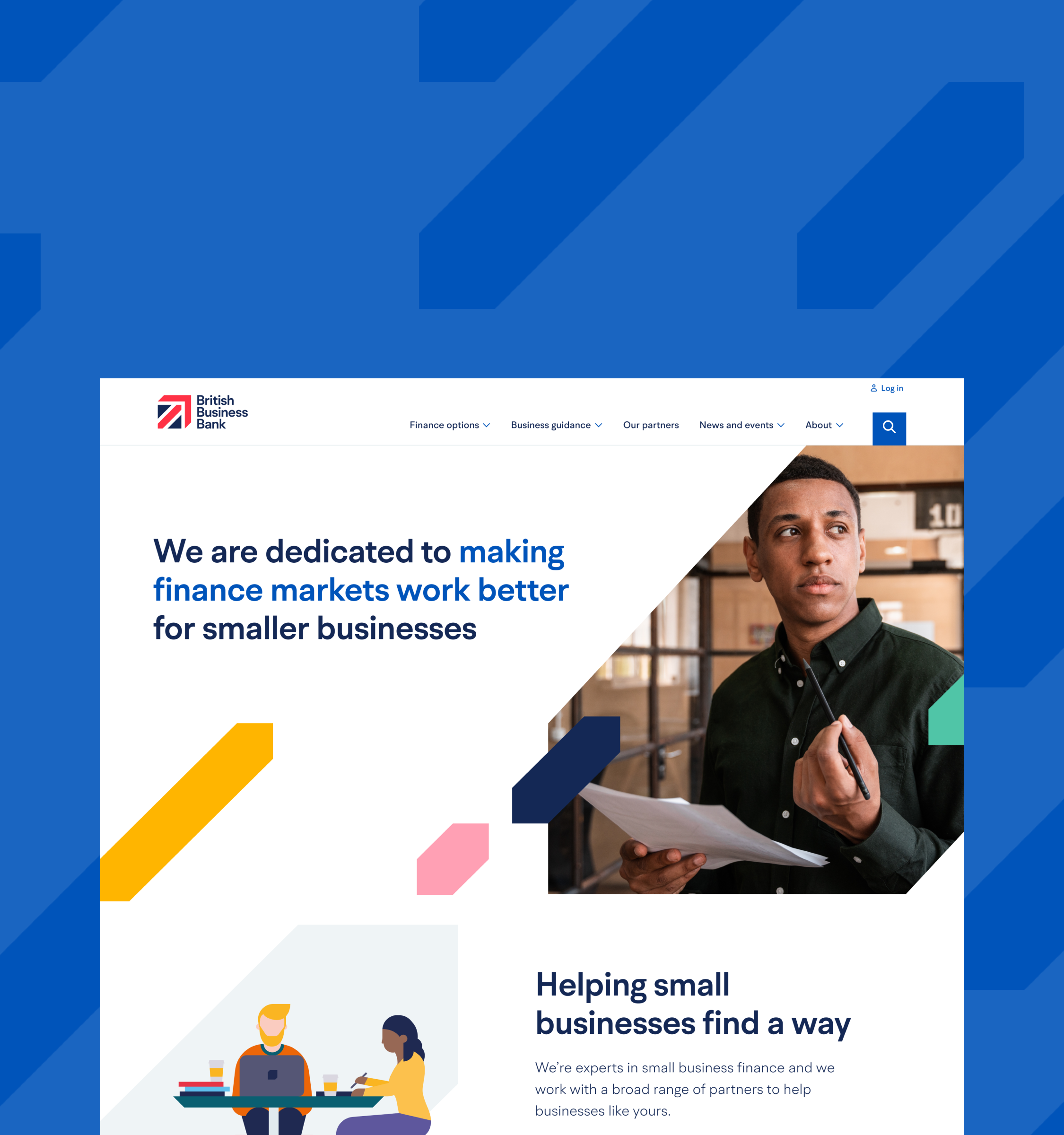
British Business Bank is a government-owned business development bank, helping small businesses in the UK to secure funding.
my role
I was the Lead Designer in a team of a UX designer, a UX Intern and a UX Researcher
DELIVERABLES
Information architecture
UX design
Visual design
Responsive web design
Design system
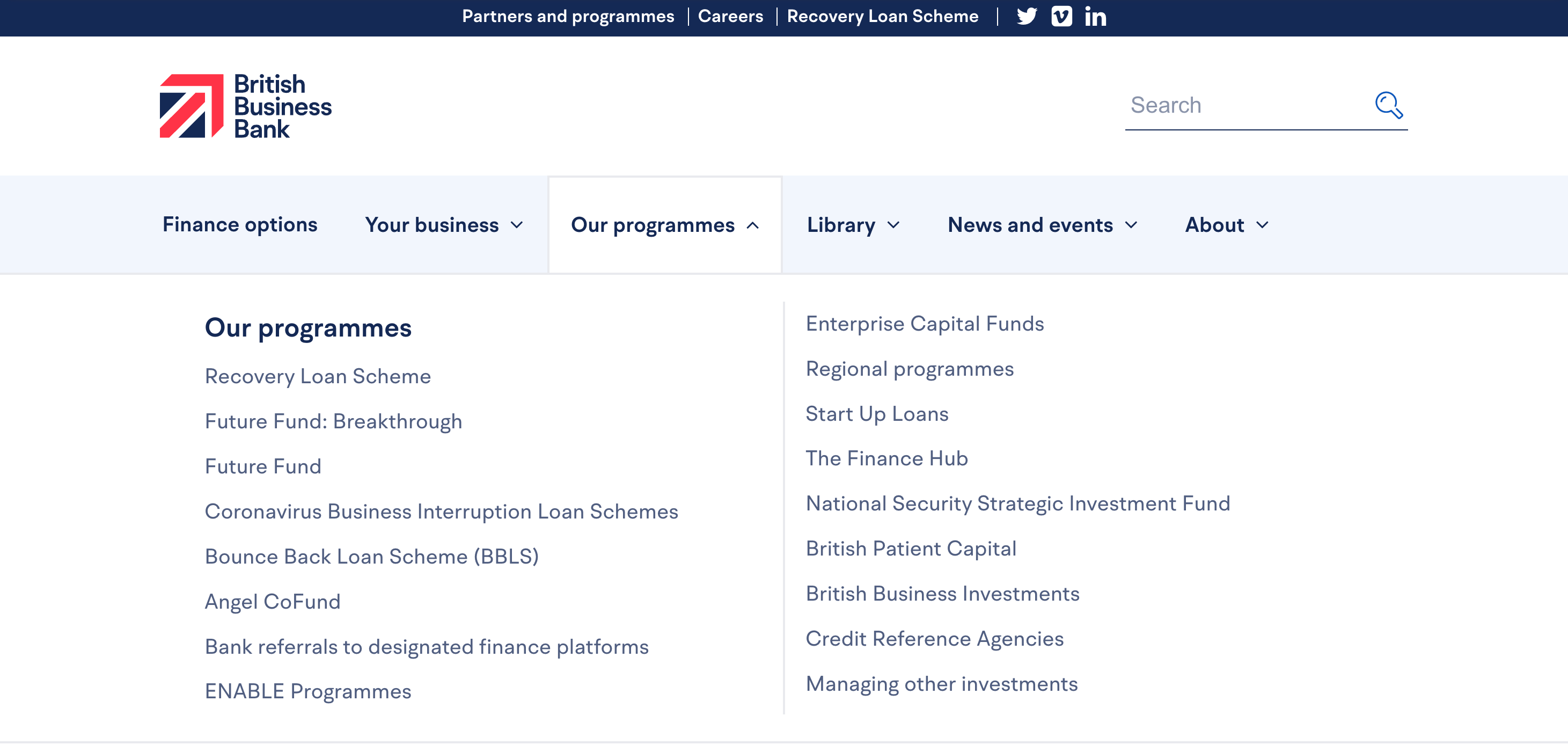
Before: the BBB navigation, Our Programmes section.
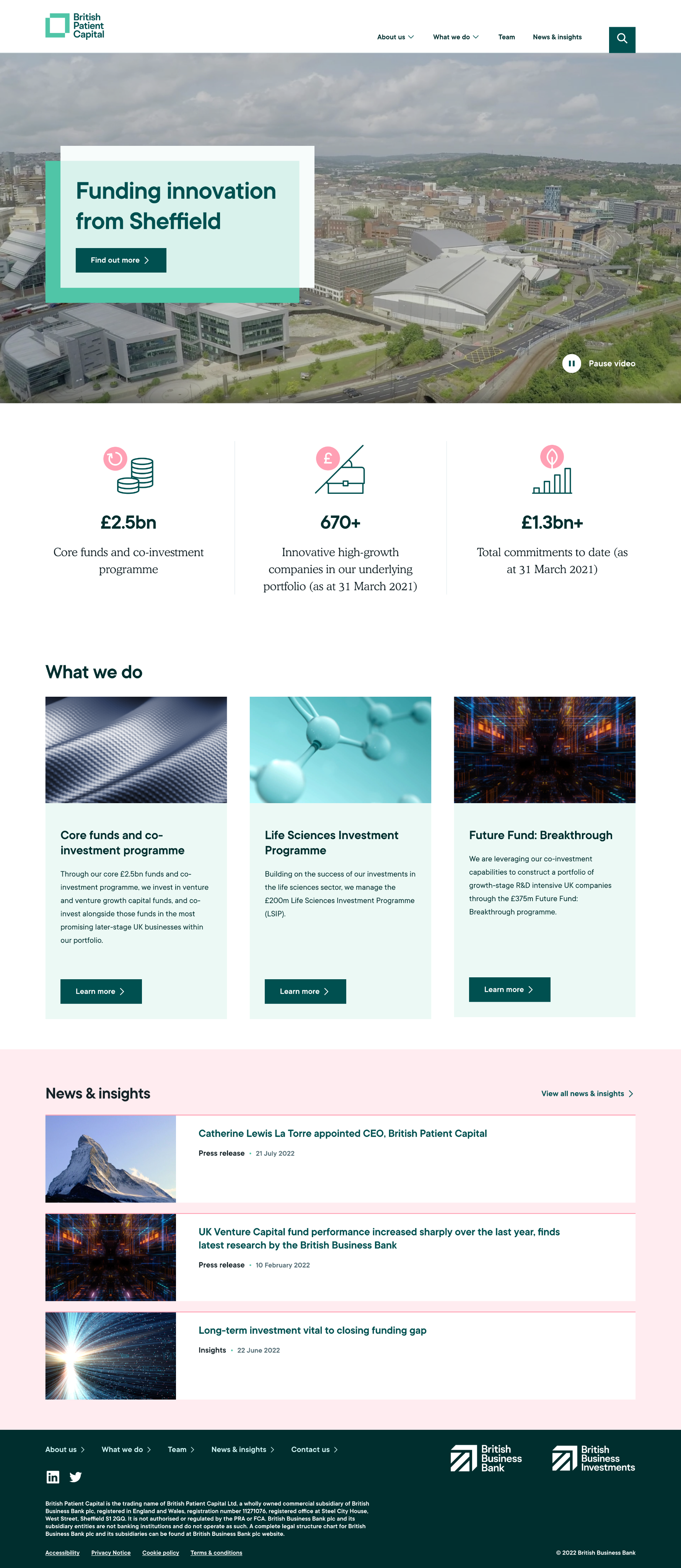
The problem
The programme pages were the most visited pages on the website based on traffic data, but the Our programmes dropdown nav was the only place where the user could get an overview of all available options. A user would have to click each one to find out what they were.
The dropdown was also serving multiple audiences – some of these offered funding for small businesses while some were directed at financial institutions to become lending partners.
To make matters more confusing, the page Finance Options in the main nav, only talked about one of the available programmes.
Testing a new site structure
Reworking the information architecture of the site became our first task. Using website traffic data, recommendations from a SEO specialist and lots of card sorting, we proposed an updated IA for the site. We conducted several rounds of tree testing to test our new IA and spent a significant amount of time to understand the best way to let users find the financing options.
our hypothesis
We believe that grouping finance options using everyday terms will improve findability
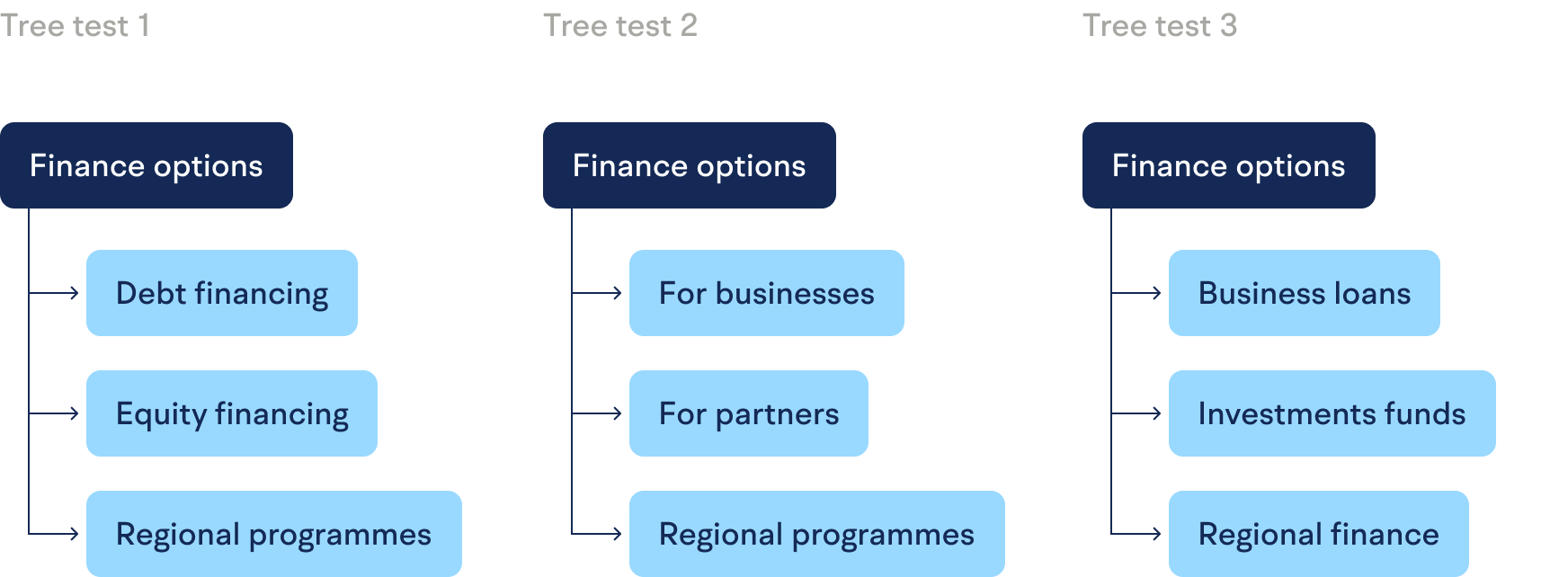
We tested grouping the Programme dropdown list in multiple ways; by type using the bank’s preferred labels (Debt and Equity), by audience (business and partners) and by type again, using more everyday terms.
Outcome
The results from our testing was clear: users preferred the finance options grouped by labels Business loans and Investment funds.
We brought our recommended navigation grouping into the new design. We also decided to group the links by audience inside the megamenu.
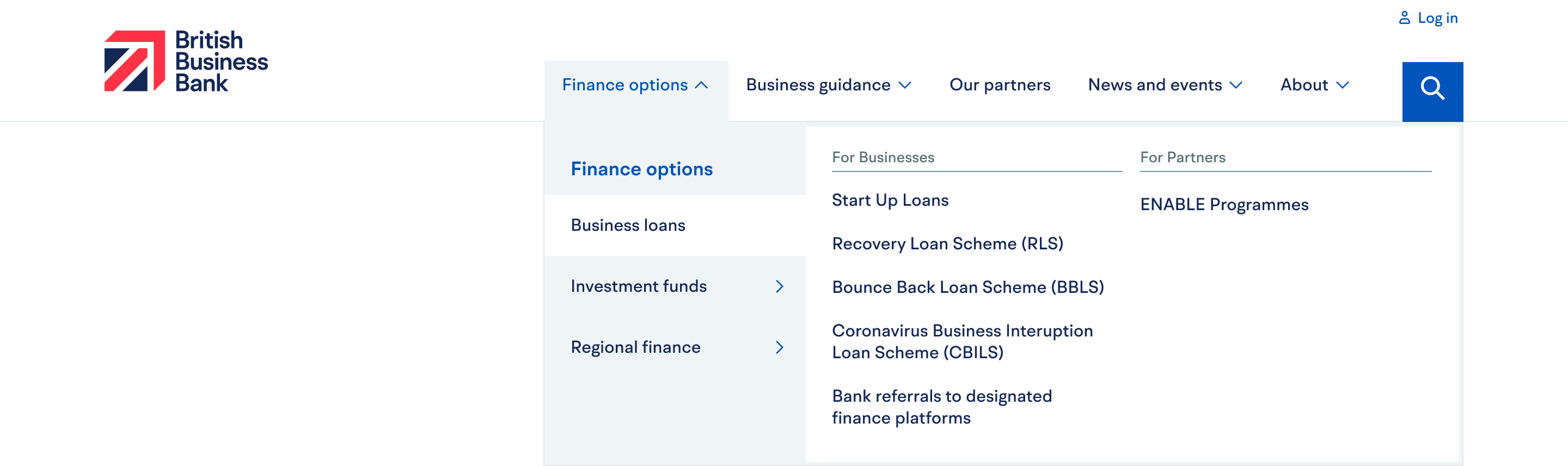
Providing an overview
We added landing pages that didn’t exist before inside the Programme section (now renamed Finance Options). This gave the bank a chance to introduce each programme and make clear which were open for applications.Closed programmes still needed to be accessible to provide info to the businesses who had lent funds from them, but were now deprioritized on the site.
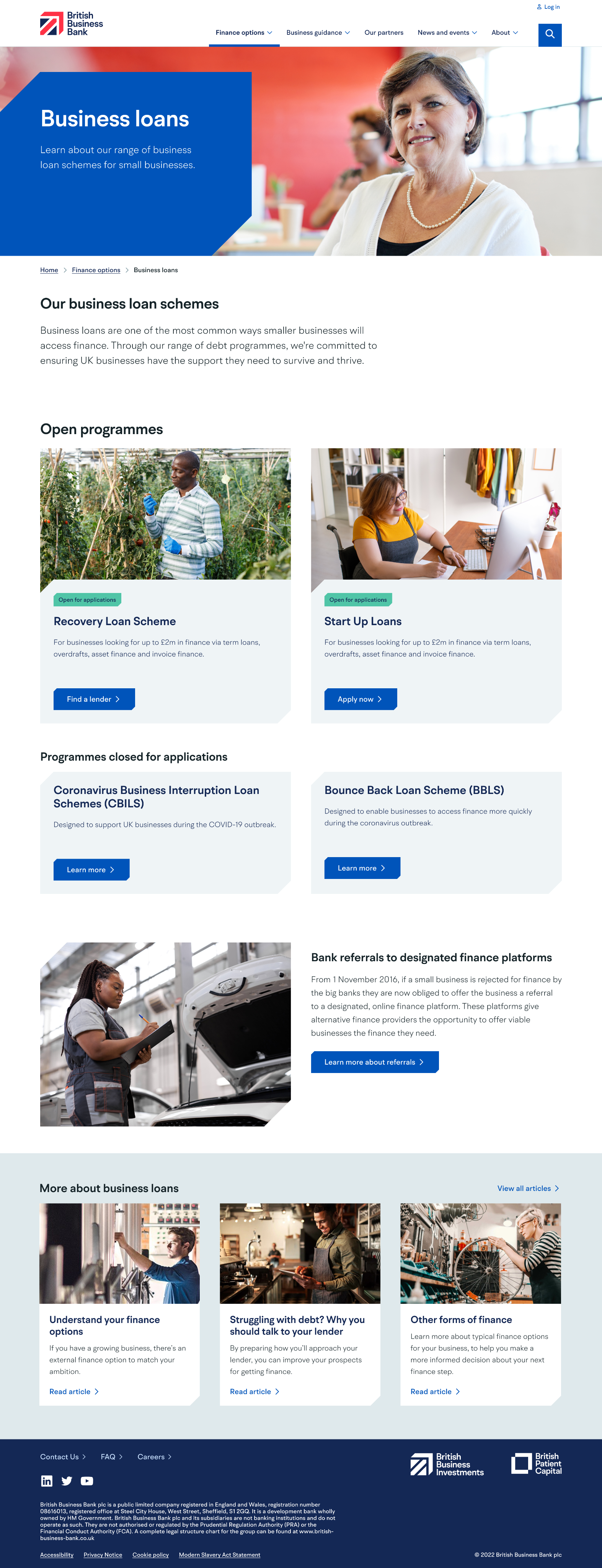
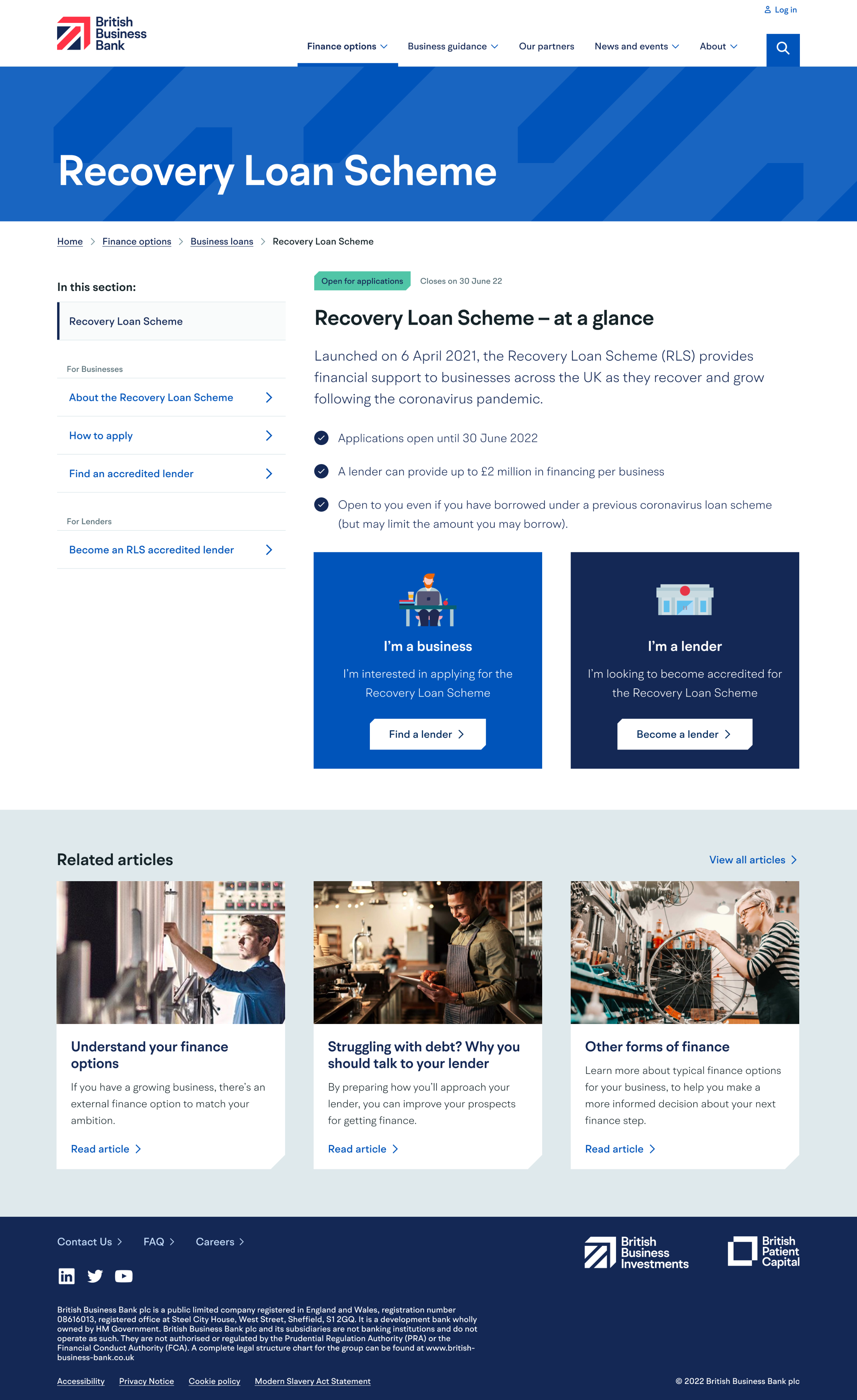
We also looked at the design of the programme page itself. Adding a new landing page, called “at a glance”, to give a summary of the programme and providing clear entry points when there were different audiences; business owners versus lenders.
Applying and uniting a brand
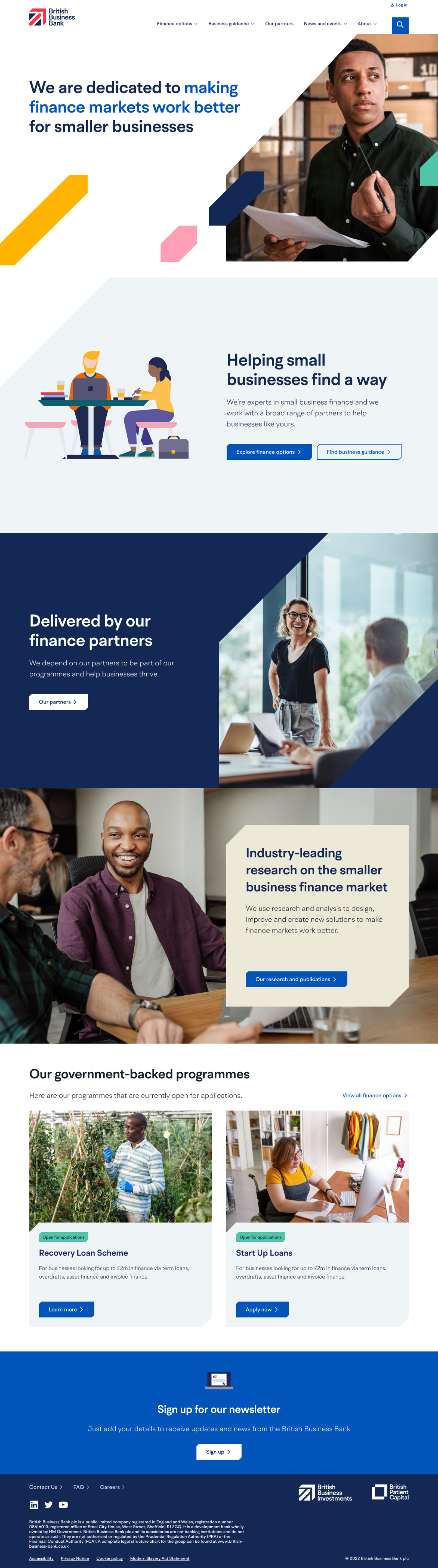
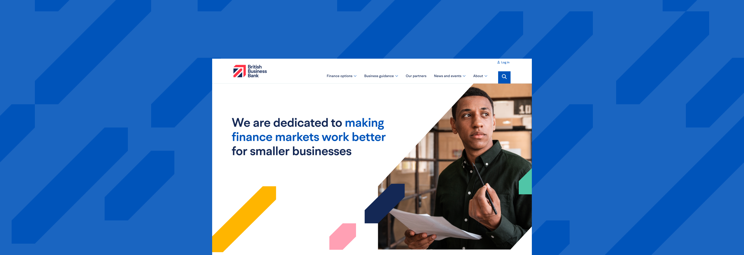
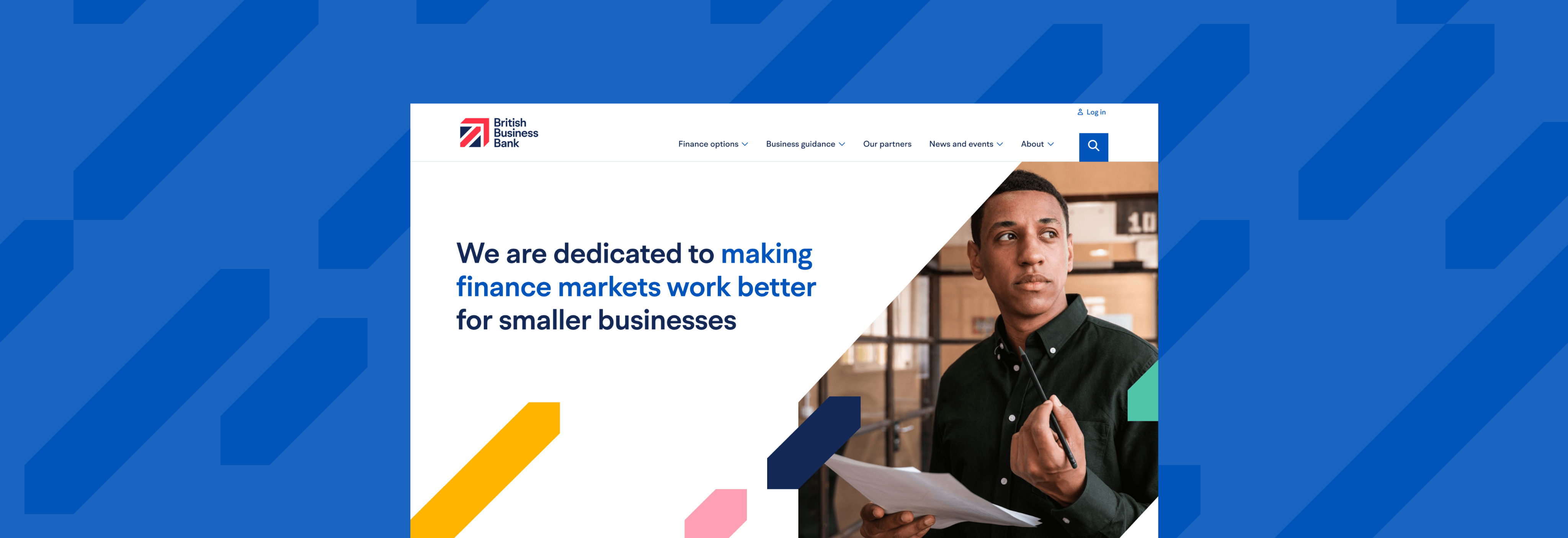
British Business Bank had a fairly new rebrand done, which was half-heartedly applied to the current site. The move to a new CMS gave the opportunity to apply the brand to the website in more depth. The brand agency had delivered a Foundations document of a design system (grids, colors, typography) and it was my role to build it out into components and apply it to the responsive website templates.
We designed out key templates for the content team to populate in the CMS.
Designing for accessibility
Being a government-owned bank, British Business Bank had stricter demands to meet accessibility requirements than most companies. We worked with a subject matter expert from RNIB (Royal National Institute of Blind people) in the UK to ensure our design met WCAG requirements. This included designing with adequate color contrast, focus states, using correct heading order, defining screen reader order and much more.


Header components for British Business Bank and its two sub brands.
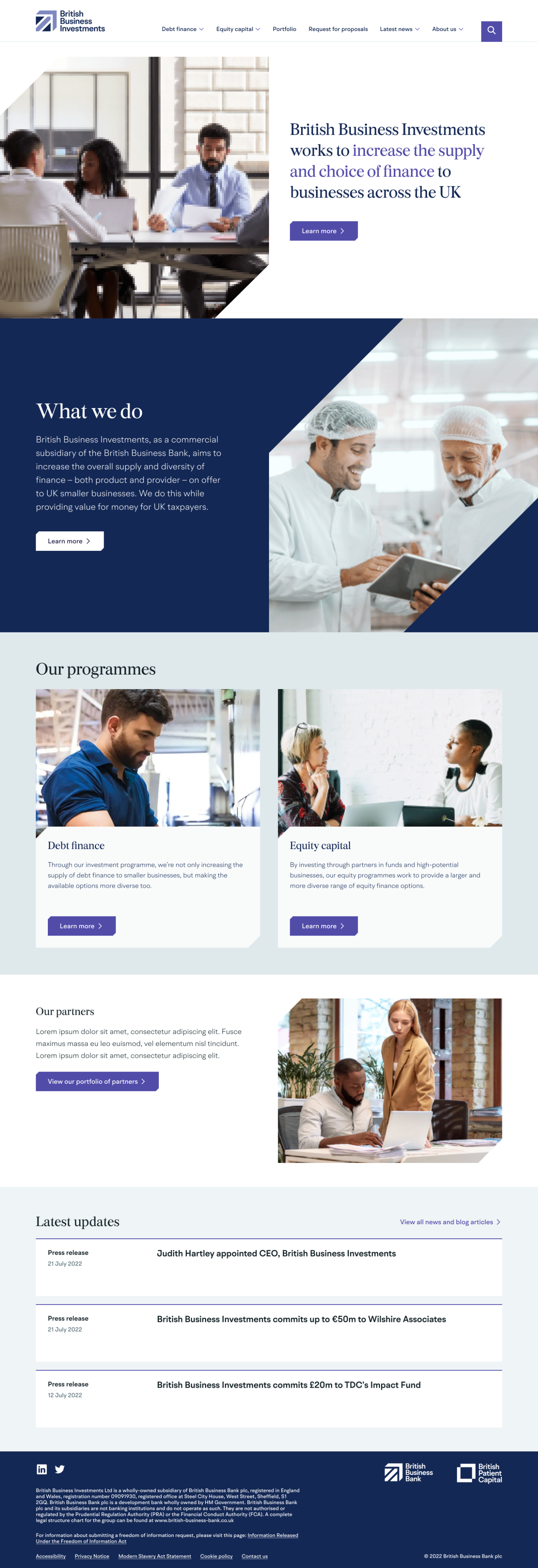
On top of its own rebrand, British Business Bank had two sub-brands which had been rebranded to closer tie in to the mother brand. These would use the same CMS templates and components as British Business Bank, just using different styling. Part of my job was defining the differences in the brand between the three sites.

Delivery
In the end, we supplied Bristish Business Bank with a new, tested IA, a design system of components for their CMS (styled in three different sub brands), and an array of templates for a whole new website.
Site content © 2025 Nina Westin


About

Contact

British Business Bank
Designing the path to financing for small businesses
Background
After years of organic growth, British Business Bank’s website had become cluttered, with a lot of content added without much thought to the overall flows. With an outdated CMS needing updating, the bank planned to to move to a new platform and bake additional separate domains of theirs into the new website in the process.
Our task
Consolidating websites where beneficial and creating a common structure and design for British Business Bank’s websites. While the design task was a “lift-and-shift” of the current content, we challenged ourselves to find small ways to improve the UX flows and making sure the site catered better to its different audiences.
The client
British Business Bank is a government-owned business development bank, helping small businesses in the UK to secure funding.
my role
I was the Lead Designer in a team of a UX designer, a UX Intern and a UX Researcher
DELIVERABLES
Information architecture
UX design
Visual design
Responsive web design
Design system
Before: the BBB navigation, Our Programmes section.
The problem
The programme pages were the most visited pages on the website based on traffic data, but the Our programmes dropdown nav was the only place where the user could get an overview of all available options. A user would have to click each one to find out what they were.
The dropdown was also serving multiple audiences – some of these offered funding for small businesses while some were directed at financial institutions to become lending partners.
To make matters more confusing, the page Finance Options in the main nav, only talked about one of the available programmes.
Testing a new site structure
Reworking the information architecture of the site became our first task. Using website traffic data, recommendations from a SEO specialist and lots of card sorting, we proposed an updated IA for the site. We conducted several rounds of tree testing to test our new IA and spent a significant amount of time to understand the best way to let users find the financing options.
our hypothesis
We believe that grouping finance options using everyday terms will improve findability
We tested grouping the Programme dropdown list in multiple ways; by type using the bank’s preferred labels (Debt and Equity), by audience (business and partners) and by type again, using more everyday terms.
Outcome
The results from our testing was clear: users preferred the finance options grouped by labels Business loans and Investment funds.
We brought our recommended navigation grouping into the new design. We also decided to group the links by audience inside the megamenu.
Providing an overview
We added landing pages that didn’t exist before inside the Programme section (now renamed Finance Options). This gave the bank a chance to introduce each programme and make clear which were open for applications.Closed programmes still needed to be accessible to provide info to the businesses who had lent funds from them, but were now deprioritized on the site.
We also looked at the design of the programme page itself. Adding a new landing page, called “at a glance”, to give a summary of the programme and providing clear entry points when there were different audiences; business owners versus lenders.
Applying and uniting a brand
British Business Bank had a fairly new rebrand done, which was half-heartedly applied to the current site. The move to a new CMS gave the opportunity to apply the brand to the website in more depth. The brand agency had delivered a Foundations document of a design system (grids, colors, typography) and it was my role to build it out into components and apply it to the responsive website templates.
We designed out key templates for the content team to populate in the CMS.
Designing for accessibility
Being a government-owned bank, British Business Bank had stricter demands to meet accessibility requirements than most companies. We worked with a subject matter expert from RNIB (Royal National Institute of Blind people) in the UK to ensure our design met WCAG requirements. This included designing with adequate color contrast, focus states, using correct heading order, defining screen reader order and much more.


Header components for British Business Bank and its two sub brands.
On top of its own rebrand, British Business Bank had two sub-brands which had been rebranded to closer tie in to the mother brand. These would use the same CMS templates and components as British Business Bank, just using different styling. Part of my job was defining the differences in the brand between the three sites.

Delivery
In the end, we supplied British Business Bank with a new, tested IA, a design system of components for their CMS (styled in three different sub brands), and an array of templates for a whole new website.
Site content © 2025 Nina Westin


About
Contact
British Business Bank
Designing the path to financing for small businesses
Background
After years of organic growth, British Business Bank’s website had become cluttered, with a lot of content added without much thought to the overall flows. With an outdated CMS needing updating, the bank planned to to move to a new platform and bake additional separate domains of theirs into the new website in the process.
Our task
Consolidating websites where beneficial and creating a common structure and design for British Business Bank’s websites. While the design task was a “lift-and-shift” of the current content, we challenged ourselves to find small ways to improve the UX flows and making sure the site catered better to its different audiences.
The client
British Business Bank is a government-owned business development bank, helping small businesses in the UK to secure funding.
my role
I was the Lead Designer in a team of a UX designer, a UX Intern and a UX Researcher
DELIVERABLES
Information architecture
UX design
Visual design
Responsive web design
Design system
Before: the BBB navigation, Our Programmes section.
The problem
The programme pages were the most visited pages on the website based on traffic data, but the Our programmes dropdown nav was the only place where the user could get an overview of all available options. A user would have to click each one to find out what they were.
The dropdown was also serving multiple audiences – some of these offered funding for small businesses while some were directed at financial institutions to become lending partners.
To make matters more confusing, the page Finance Options in the main nav, only talked about one of the available programmes.
Testing a new site structure
Reworking the information architecture of the site became our first task. Using website traffic data, recommendations from a SEO specialist and lots of card sorting, we proposed an updated IA for the site. We conducted several rounds of tree testing to test our new IA and spent a significant amount of time to understand the best way to let users find the financing options.
our hypothesis
We believe that grouping finance options using everyday terms will improve findability
We tested grouping the Programme dropdown list in multiple ways; by type using the bank’s preferred labels (Debt and Equity), by audience (business and partners) and by type again, using more everyday terms.
Outcome
The results from our testing was clear: users preferred the finance options grouped by labels Business loans and Investment funds.
We brought our recommended navigation grouping into the new design. We also decided to group the links by audience inside the megamenu.
Providing an overview
We added landing pages that didn’t exist before inside the Programme section (now renamed Finance Options). This gave the bank a chance to introduce each programme and make clear which were open for applications.Closed programmes still needed to be accessible to provide info to the businesses who had lent funds from them, but were now deprioritized on the site.
We also looked at the design of the programme page itself. Adding a new landing page, called “at a glance”, to give a summary of the programme and providing clear entry points when there were different audiences; business owners versus lenders.
Applying and uniting a brand
British Business Bank had a fairly new rebrand done, which was half-heartedly applied to the current site. The move to a new CMS gave the opportunity to apply the brand to the website in more depth. The brand agency had delivered a Foundations document of a design system (grids, colors, typography) and it was my role to build it out into components and apply it to the responsive website templates.
We designed out key templates for the content team to populate in the new CMS.
Designing for accessibility
Being a government-owned bank, British Business Bank had stricter demands to meet accessibility requirements than most companies. We worked with a subject matter expert from RNIB (Royal National Institute of Blind people) in the UK to ensure our design met WCAG requirements. This included designing with adequate color contrast, focus states, using correct heading order, defining screen reader order and much more.


Header components for British Business Bank and its two sub-brands.
Designing for accessibility
On top of its own rebrand, British Business Bank had two sub-brands which had been rebranded to closer tie in to the mother brand. These would use the same CMS templates and components as British Business Bank, just using different styling. Part of my job was defining the differences in the brand between the three sites.
Delivery
In the end, we supplied British Business Bank with a new, tested IA, a design system of components for their CMS (styled in three different sub brands), and an array of templates for a whole new website.
Site content © 2025 Nina Westin
About
Contact